Monte Carlo resampling shows how a calculation changes when its inputs are rearranged or sampled again. It does not turn a backtest into a forecast. Here we draw from 24 separate monthly MTR backtests to build 10,000 synthetic twelve-month paths. The useful finding is how strongly the output depends on a small, uneven input sample.
The input includes +422.38% in October 2025 and −46.41% in August 2024. Both are simulated results from the same monthly test template. Neither is a live-account return.
The short answer
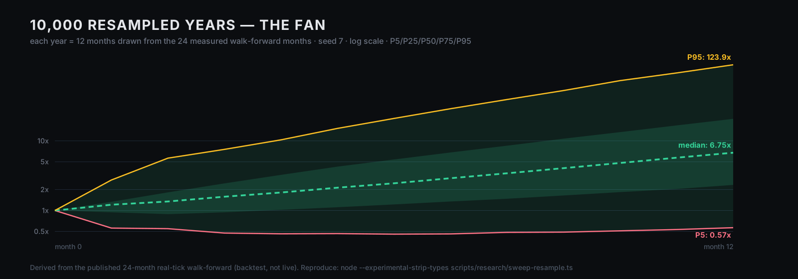
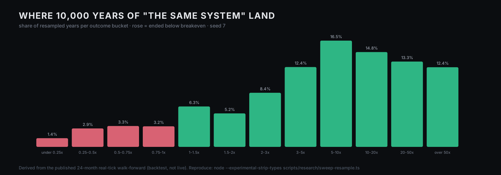
Each input is a fresh-$10,000, generated-tick MT5 test. Sampling twelve monthly percentages with replacement and multiplying them produced a median synthetic ending value of 6.75× the starting value. P5 was 0.57× and P95 123.90×; those are percentiles within this model, not the bounds of possible future returns. 10.7% of the simulated paths ended below their starting value. That is a simulation frequency, not MTR's live probability of loss.
The median maximum decline measured only at month-end was 46.4%. Removing the +422.38% input changed the synthetic median to 3.29× and the losing-path frequency to 17.4%. These large changes are reasons to question the input distribution and compounding assumptions before using any result for a trading decision.
| Question | What this calculation can answer |
|---|---|
| How sensitive is the result to the input sample? | Removing its best month roughly halves the synthetic median |
| Does a positive median rule out losses? | 10.7% of these simulated paths finished below their start |
| Can an initially negative path later finish positive? | Yes; the first two returns compounded negative in 27.8% of positive-ending paths |
| Does this measure all drawdown? | No; it misses losses inside each month and floating positions |
| Is this a live success rate? | No; the model resamples historical simulations under strong assumptions |
The method — plainly, before the numbers
The input. SWEEP_24MO in the website source (src/data/mtr-backtest.ts) contains 24 monthly test results from January 2024 through December 2025. The source runner, deployment/sweep_24months.ps1, changes the dates in ic_markets_backtest_apr2026_lot010.ini. That template uses XAUUSD M5, $10,000 initial capital, 1:100 leverage, Model=0, Optimization=0, and ForwardMode=0. Each monthly run starts again from $10,000. There is no train/test rotation in that runner, so calling it walk-forward validation would be incorrect.
The MetaTrader 5 documentation distinguishes generated "Every tick" testing from "Every tick based on real ticks". These inputs use the generated mode. The percentages are rounded to two decimals in the source CSV; the bootstrap uses those rounded values, shown in full below.
The experiment. Draw 12 percentages at random with replacement, multiply 1 + return for each, and repeat 10,000 times. The main calculation uses mulberry32(7); the run excluding the best month uses seed 8. Percentiles select sorted index floor(q × (n − 1)). This reproduces the arithmetic on the published inputs; it does not reproduce or independently verify the underlying MT5 tests.
The compounding assumption. Multiplying returns from separate fixed-deposit runs assumes the same percentage outcome could be applied to the changing balance at every step, with no open positions carried between months. A grid EA's lot rounding, margin, exposure limits, and recovery baskets can break that assumption. These synthetic paths are not continuous EA backtests.
The question. How dispersed is the arithmetic outcome under this particular sample and these assumptions? The calculation cannot answer what MTR will earn next year, whether it has an edge, or how much capital is safe to risk.
I — The 24 months, measured
Before any simulation, the raw table (arithmetic only, no resampling):
| Statistic | Value |
|---|---|
| Months | 24 |
| Mean month | +35.03% |
| Median month | +22.05% |
| Standard deviation | 94.04% |
| Best month | +422.38% (Oct 2025) |
| Worst month | −46.41% (Aug 2024) |
| Negative months | 6 of 24 (25.0%) |
| Months at −40% or worse | 3 |
| Months at +40% or better | 5 |
| Longest losing streak | 2 months |
The sample standard deviation is 94.04 percentage points, much larger than its mean monthly return. This describes dispersion among these 24 simulations; it is not an estimate with enough independent evidence to establish the future return distribution.
II — The fan
Compound twelve random draws from that table, 10,000 times:
| Percentile within this simulation | Synthetic ending-value multiple |
|---|---|
| P5 | 0.57× (−43%) |
| P25 | 2.33× |
| Median | 6.75× |
| P75 | 20.72× |
| P95 | 123.90× |
Outcomes also fall outside P5–P95. Very large multiples can arise when sampling the extreme positive month repeatedly and assuming returns keep scaling with capital. That is a consequence of this model, not evidence that an account can attain those balances.
III — Drawdown at month-end
After each draw, the script compares the synthetic balance with its prior peak. It records the largest decline among the twelve month-end observations:
| Maximum month-end drawdown within each synthetic path | Value |
|---|---|
| P5 | 5.8% |
| Median | 46.4% |
| P95 | 81.6% |
The 46.4% figure is the median of path drawdowns, not necessarily the drawdown of the path with the median final balance. The calculation has no intramonth equity data. It cannot reveal floating losses, margin calls, or a basket's deepest decline before it closes. It must not be used as an account loss ceiling.
IV — The first two draws
We tagged each synthetic path whose first two sampled returns compounded to less than 1, then checked its final value.
2,481 of the 8,933 positive-ending paths — 27.8% — had a combined loss after two draws. This does not mean both individual months were negative.
This illustrates why early and final outcomes can differ within a model. It does not justify keeping a losing live strategy running or overriding a risk limit: live losses may reflect broken assumptions, execution failures, or an unmodelled regime. Set review and stop criteria before trading; see backtest versus live results.
V — Remove the monster month
The obvious objection — we'll raise it ourselves: October 2025's +422% is one month in 24. How much of the story is that single row?
Repeat the protocol with 10,000 synthetic paths drawn from the remaining 23 percentages, using seed 8:
| All 24 months | Excluding +422% | |
|---|---|---|
| Median synthetic ending multiple | 6.75× | 3.29× |
| P5 / P95 | 0.57× / 123.9× | 0.41× / 27.1× |
| Paths ending below their start | 10.7% | 17.4% |
| Median maximum month-end drawdown | 46.4% | 48.0% |
Removing one extreme observation substantially changes the output. A positive median after removing it still does not establish profitability: the remaining sample retains other large positive simulations and all the original modelling limitations.
The limits — before you ask
Stated plainly, because a study that hides its limits is an ad:
The inputs are simulations. All 24 are generated-tick monthly tests with a fresh $10,000. The runner does not establish an out-of-sample boundary. Resampling cannot remove fitting bias, optimistic execution assumptions, missing costs, or limitations of the underlying broker history.
n = 24 is thin. Ten thousand draws do not create ten thousand years of independent market evidence. The bootstrap only reuses the 24 inputs; unseen losses and regimes remain absent.
Months are drawn independently and returns are assumed to scale. The model removes calendar order, does not preserve regime clustering or open baskets, and assumes percentage returns can be reapplied at each new balance. These assumptions can materially change both returns and losses.
The model omits intramonth equity and live execution. Its drawdowns and losing-path frequencies are conditional model outputs, not a live probability of ruin, a forecast, or typical customer results.
What this changes — for you, tomorrow
Ask for provenance before percentiles. Identify the tick mode, dates, leverage, cost assumptions, and whether parameters were chosen using the tested period. A detailed distribution built from weak inputs is still weak evidence.
Do not size from a median simulated drawdown. Losses can exceed the model's percentiles, especially when intramonth equity is missing. The bet-sizing discussion and drawdown-recovery calculator explain the arithmetic; neither validates this EA or establishes a safe exposure.
Keep operational stop rules separate from the bootstrap. A synthetic recovery does not excuse broken execution, a breached loss limit, or a strategy operating outside its tested conditions.
Where MTR sits
We sell MTR, the software whose monthly test table supplies this example. This is our own analysis, not an independent certification. Its generated-tick inputs and fragile compounding assumptions limit what the MTR evidence can support.
For a separate exercise, our free Monte Carlo simulator generates trade-level paths from a win rate, payoff, and risk assumptions. It shares a seeded random-number generator with this study, but it does not run this monthly bootstrap or reproduce MTR's results. The Evolution Lab describes other research workflows; their outputs also depend on the data and validation design.
Disclosure
The table and script make this calculation inspectable; they do not prove that parameter selection or the original testing process was free of selection bias. We have not established an independently verified live track record through this study. Trading can lose the capital committed to it.
Reproduce it
The public research package reads the rounded percentages below and regenerates the statistics and both figures. Download and extract the ZIP, then run these commands in that folder. You do not need the website source checkout.
Appendix — all 24 rows
The complete rounded input in src/data/mtr-backtest.ts. Each row is a separate fresh-$10,000 MT5 run using generated ticks and 1:100 leverage, with no forward-test split:
| Month | Result | Month | Result |
|---|---|---|---|
| 2024-01 | +8.08% | 2025-01 | +24.23% |
| 2024-02 | +10.53% | 2025-02 | −22.28% |
| 2024-03 | −24.35% | 2025-03 | +65.25% |
| 2024-04 | +69.30% | 2025-04 | +7.56% |
| 2024-05 | +27.00% | 2025-05 | −44.15% |
| 2024-06 | +20.97% | 2025-06 | +0.53% |
| 2024-07 | +25.20% | 2025-07 | +9.98% |
| 2024-08 | −46.41% | 2025-08 | −41.88% |
| 2024-09 | +24.59% | 2025-09 | −5.84% |
| 2024-10 | +33.26% | 2025-10 | +422.38% |
| 2024-11 | +39.46% | 2025-11 | +40.29% |
| 2024-12 | +23.14% | 2025-12 | +173.98% |
Every statistic and both figures in this study derive from these 24 numbers and nothing else.
More simulated paths do not create more historical evidence. Check the inputs and assumptions before trusting the distribution.