New

11 tools. $557.98 if bought one by one. 5 new Premium desks inside.$557.98 one by one

$97 once$97See all 11See it
Pine Pro Library · Pine v6

Volume Profile Lite volume profile indicator for TradingView

On every bar it spreads the last 200 bars' volume over 60 price rows, marks the busiest row as the POC, and grows the value area around it until seventy of every hundred units are inside.

Tags03:15
POC
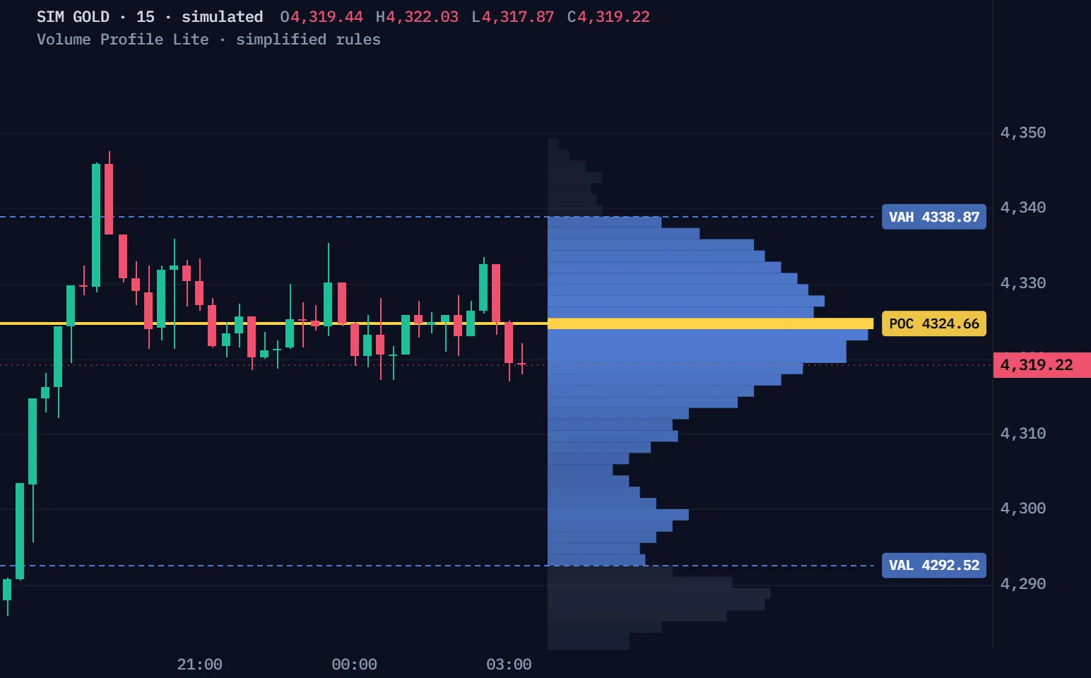
4324.66
VAH
4338.87
VAL
4292.52
◆ VP Lite · ProEA LabRolling 200 · 60 rows

Window 1 · the first jump

Simulated 15-minute gold bars, not a real market, run through Volume Profile Lite's default rules, simplified for the browser: at each close a profile of the last 200 bars, their volume spread over 60 rows, the value area grown from the busiest row to seventy of every hundred units. The chart draws what the script draws on its last bar: the histogram, the POC, the VAH and VAL, and their tags. Window 1 is the first simulated POC jump of five rows or more once the profile's first 200 bars have loaded; Another jump plays the next jumps in order, each after the window before it ends, whatever the POC does next.

Read as text
Times are bar opens on the simulated New York clock. Prices are the tags' own, to the tick.
TimeEventPrices
17:15Window opens · the profile of the last 200 barsPOC 4334.69 · VAH 4345.69 · VAL 4285.65
22:00A second peak: its row is drawn 54 of 60, nine tenths of the longest or moreNear 4323.23
23:15The POC jumps 6 rows down, from 4333.69POC 4323.23 · VAH 4346.76 · VAL 4291.00

Pine v6 · the full source in Pine Pro Library. It draws on your chart; you place the trades.

The POC can jump.

The POC is the longest row; when another row grows longer, the POC jumps to it, however far away.

4323.23

The POC is at 4323.23: the profile rolls on, and the next close can move it again.

  • The POC before: true, 21:45 · POC 4331.49
  • A second peak: true, 22:00 · near 4323.23, 54 of 60
  • The jump: true, 23:15 · POC 4323.23
  • After the jump: true, 00:15 · POC 4323.23

The same simulated 15-minute gold, simplified rules: the replay's window 1, up close. Row lengths are the script's own, out of the 60 bars it draws the longest row across.

POC

The longest row

The row with the most volume; on a tie, the lower row.

Rolling

200 bars

Each close adds the newest bar and drops the oldest, so rows shrink as well as grow.

Jump

No slide

The POC moves straight to whichever row is longest; it never travels through the rows between.

Rows

Sixty, re-cut

The 200 bars' high-to-low range in 60 equal rows: a new high or low re-cuts every row.

One bar can move it.

The newest bar's volume lands on the rows its range covers, and a heavy enough bar makes one of them the longest.

Its volume
108.00
POC 96.20 the POC's row still holds the most, 86 units: this bar's 1,000, spread over its own rows, lift none of them past it. Value runs from 88.00 to 101.60.

Drawn bars, not the replay: 199 fixed bars of 8 to 16 units each and one bar you move. The profile is the script's own build.

Spread

High to low

A bar's volume is spread over the rows its range covers, by how much of each row it overlaps.

Range

Rows re-cut

A close past the old high or low widens the range, so every row gets taller.

Estimate

Not tick data

Bars, not trades: the profile estimates where volume traded inside each bar.

Live

It redraws

On a live chart it redraws with the forming bar; earlier profiles are not kept.

Seventy, row by row.

From the POC, the row above and the row below compare, and the larger joins until seventy of every hundred units are inside.

Profile
5 of 5
72 of 100 The row above holds 7; the row below holds 9. The larger, below, joins: 72 of 100. Seventy reached: value runs from VAL 2004.00 to VAH 2010.00.

A drawn profile of 100 units, not the simulation. Each step is the script's own rule; it adds whole rows, so value can pass seventy.

POC

The busiest row

The row with the most volume; on a tie, the lower one.

Rows

One a side

One row above against one below; at an end, the side that is left.

Tie

Goes up

Equal rows add the one above.

Share

Seventy

The Value Area input: 70 by default, from 50 to 90.

Paste it. Run it.

One file, the complete script, ready for TradingView's Pine Editor.

On a phone? Send this page to your desktop.

  1. Copy the scriptThe button copies the whole file.
  2. Paste it in the Pine EditorOpen a new indicator, replace the sample, save.
  3. Add it to a chartAny chart whose feed has volume; the profile sits right of the last bar.
volume-profile-lite.pine · 177 linesDownload volume-profile-lite.pine
//@version=6// ─────────────────────────────────────────────────────────────────────────────// Volume Profile Lite — ProEA Lab// Free volume-at-price, full source: the value-area histogram with POC,// VAH and VAL, in Session or Rolling mode.//// Honest by design://  · Engine = bar-distribution: each bar's volume is spread across its//    [low, high] range into price rows — an approximation, not tick data.//  · The profile redraws as the live bar develops; closed-bar history is//    read as-is and never rewritten.//  · Context, not signals — it shows where volume traded, never what price//    will do.//// © ProEA Lab — source available for download.// ─────────────────────────────────────────────────────────────────────────────indicator("Volume Profile Lite — ProEA Lab", "VP Lite", overlay = true, max_boxes_count = 200, max_lines_count = 50, max_labels_count = 20) // ───────────────────────── Inputs ─────────────────────────gP = "Profile"inMode     = input.string("Rolling", "Mode", options = ["Rolling", "Session"], group = gP, tooltip = "Rolling = the last N bars. Session = the current day's profile.")inLookback = input.int(200, "Rolling lookback (bars)", minval = 20, maxval = 500, group = gP)inBins     = input.int(60, "Rows (bins)", minval = 10, maxval = 120, group = gP, tooltip = "Price resolution of the histogram.")inVApct    = input.float(70, "Value Area %", minval = 50, maxval = 90, group = gP) / 100.0 gS = "Style"inAnchor   = input.string("Right", "Profile side", options = ["Right", "Left"], group = gS, tooltip = "Right = profile to the right of the last bar. Left = overlays the start of the window.")inWidth    = input.int(60, "Profile width (bars)", minval = 10, maxval = 150, group = gS)inShowLvls = input.bool(true, "Show POC / VAH / VAL lines", group = gS)inShowTags = input.bool(true, "Show price tags", group = gS) // ───────────────────────── Fixed Aurora palette ─────────────────────────

No coding needed.

View the full code

01 · Library

Full source

The full Pine v6 source is in Pine Pro Library: read it, change it, keep it.

02 · Pine v6

One file

An overlay: the histogram, the POC, VAH and VAL lines and their price tags.

03 · Your chart

Rolling or Session

The last 200 bars, or today's bars from the symbol's daily boundary.

04 · Alerts

None

It draws the profile; it sends no alerts and prints no signals.

Delta, naked POCs. One payment.

Advanced Volume Profile splits each row by buying and selling inferred from the bars, keeps past sessions' untested POCs on the chart, and adds alerts.

Advanced Volume Profile Pine v6 indicator

  • Volume delta per row, inferred from bar direction, and a Delta POC
  • Naked POCs from past sessions, until price trades back through
  • Absorption: heavy volume meeting balanced delta, flagged
  • Four alerts and a Co-Pilot panel that reads the profile in words
$49, one payment.
Get Volume Profile $49

Full Pine source No subscription 7-day refund before download

Volume Profile Lite stays in Pine Pro Library, with its full source.

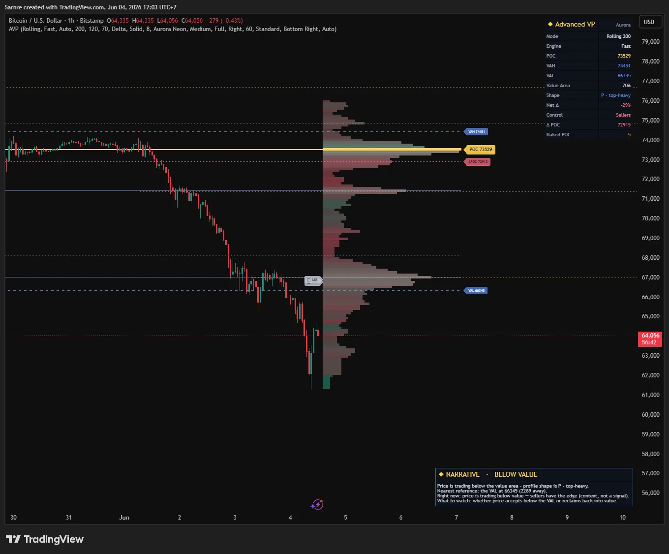
Advanced Volume Profile on a TradingView chart of BTCUSD, one hour: the volume histogram beside price, the POC, the value area edges, a dashboard and a narrative panel.
Advanced Volume Profile on a real TradingView chart: BTCUSD, 1 hour, 4 June 2026. Unmodified capture.

Straight answers.

What do I get?

The page, the films and the manual are open to everyone. The code, the complete script, is in Pine Pro Library: $49 once for every desk and every update, or included in the Complete Suite. Sign in to copy or download.

Why did the POC jump so far?

The POC is only ever the longest row. When a row far away grows longer, the POC moves there on that bar; it never slides through the rows between.

Why does my profile differ from another chart's?

It reads your chart's own bars and volume: another feed, timeframe or last bar builds other rows. Forex and some CFDs report tick activity, not units traded.

Does it have an edge?

No measured edge. It describes where volume traded and places no trades. How the estimates work says where it stops.

What does Advanced Volume Profile add?

Volume delta per row, naked POCs from past sessions, absorption flags and alerts. Volume Profile Lite stays in Pine Pro Library either way.

We, ProEA Lab, build Volume Profile Lite. The films run its rules, simplified, on simulated candles, not market data. Not financial advice.

Full manual.

Every rule, setting and check, one topic at a time.

Open the full manualClose the full manual

Volume Profile Lite · Pine Pro Library

See where trading was busiest.

Find the busy price zones on your TradingView chart. Then see how price behaves around them.

A map of estimated activity. It does not give buy/sell signals.

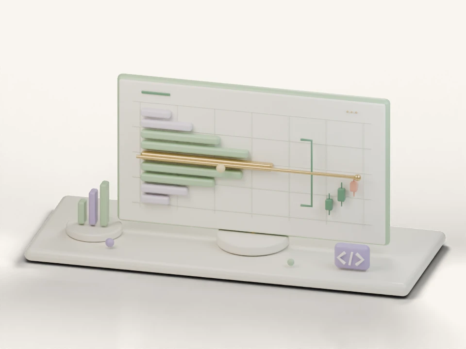
Pastel clay illustration of volume collecting into horizontal price rows, highlighting the busiest row and framing the value area's upper and lower edges.
Workflow illustration
  1. Group volume by price

    Bars contribute to horizontal rows.

  2. Find the busiest row

    Highlight the point of control.

  3. Frame the value area

    Mark the main concentration and both edges.

See the profile explained

What is Volume Profile Lite?

Volume Profile Lite is a TradingView indicator in Pine Pro Library that estimates volume by price and draws a horizontal profile, point of control and value area boundaries. Choose a rolling window or the current daily session. It distributes candle volume across price rows, so the profile is an estimate rather than a record of individual trades.

What is the difference between Rolling and Session mode?

Rolling uses a fixed number of recent candles, two hundred by default. Session uses the symbol's current daily boundary, which may differ from local midnight. The session calculation includes at most the latest two thousand bars. Read window and detail settings

Why do the POC and value area lines move?

The profile recalculates as the live candle changes or the selected window advances. Its busiest row and value boundaries can therefore move. Volume Profile Lite redraws the current profile; it does not store a historical profile for every candle. Read why the profile changes

Does Volume Profile Lite show buy and sell order flow?

No. It spreads each candle's available volume across that candle's price range. It does not separate buyer and seller volume or reconstruct individual trades. Depending on the instrument and feed, the volume may represent tick activity. Read the volume estimation limits

Why this tool exists.

A chart shows where price went. This tool adds another clue: where was trading busiest?

From trades to a map

Imagine a market’s sales receipts. Add up how many units sold at each price. The biggest total shows its busiest price. That is the idea behind Volume Profile: group trading activity by price.

How VP Lite helps

VP Lite estimates that map from the price bars, or candles, on your chart. Busy areas give you places to watch as price returns to them or moves beyond them.

Slide to build the map.

Press Play or move the slider. Watch volume build the rows on the right.

Fictional candles · 10 rows for clarity; the indicator starts with 60. The longest row fills the width at each step. Rows and levels update as data changes.

One candle becomes several rows. This candle’s 12 units are shared across $100–$103. All rows start equal, so no price stands out yet.

This candle adds 12 volume units.

Latest price
$102.00
Gold row · tied
$100.15
Blue zone
$100.00–$102.10
Find these markers on a real chart ↓

How can this help you make money?

Use the map to choose an area to study. Then use your trading rules to decide when to enter, where to take profit, and when to exit if you are wrong.

Across trades, gains must cover losses and trading costs. The map alone cannot tell you whether a trade will succeed.

A simple example: where a gain or loss comes from

Suppose the map helps you find a busy area to watch. Your entry rules are met, and you buy 1 unit at $100. You plan to take profit at $106 or exit a losing trade near $97.

If you sell at $106
$6 gain before costs.
If you sell at $97
$3 loss before costs.

These are made-up prices, not signals from VP Lite. Fees and the price you actually get can change the result. A bigger possible gain does not tell you how often the trade will work.

Practise with virtual money first. Record your entries, exits and costs to see how your complete plan performs.

Understand the map.

Longer rows mean more estimated volume at that price.

Gold line

Busiest price row · POC.

Blue zone

About 70% of estimated volume · Value Area.

Dashed edges

Top: VAH. Bottom: VAL.

Now find them on a real chart.

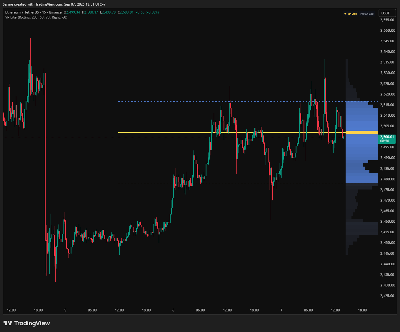
ETH/USDT · 15-minute candles · Binance

Real TradingView ETH/USDT 15-minute chart with Volume Profile Lite. Price is inside the blue volume area, just below the gold POC line. The upper and lower dashed edges surround that area.
TradingView snapshot · . Guide labels 1–3 added.Open full-size chart ↗ (new tab)

Here, price is inside the blue zone. Compare that with “Inside” in the example below.

  1. Gold line · POC

    2,502.08 — the busiest price row.

  2. Upper edge · VAH

    2,516.67 — the top of the blue zone.

  3. Lower edge · VAL

    2,478.27 — the bottom of the blue zone.

All prices in USDT. Default settings: Rolling 200 · 60 rows · 70% Value Area.

Your chart will show different prices and levels as its data changes.

Try three situations.

Choose an example to see what changes.

Price is inside the busy zone.The white price line sits between the two dashed edges. Blue rows mark the busy zone. The gold row has the most estimated volume. Dashed lines mark the upper and lower edges.
Top dashed line · VAHBottom dashed line · VALGold line · POC
Made-up example. The blue zone stays fixed so you can compare. On your chart, the profile updates as data changes.

Price is inside the busy zone.

What you see
The white price line sits between the two dashed edges.
What it means
Price is within the area that holds most of this profile’s estimated volume.
What to watch next
Watch what happens at either edge. Being inside does not mean price must stay there.
Quick check: price is above the blue zone. Does that mean buy?

No. It only tells you where price is relative to that area. Watch whether the move holds or comes back inside, then use your own entry and risk rules.

Add it to your chart.

The full source is in Pine Pro Library. Copy, paste, and keep it.

  1. Open the editor

    On a TradingView chart, use the Pine icon to open Pine Editor.

  2. Copy and paste

    Copy the code below. Paste it in place of the editor’s sample code.

  3. Add to chart

    Choose Add to chart, then save the script to keep it.

Indicator code

Copy the code as it is. No coding needed.

View the full code
First time? Keep the default settings.

Rolling · 200 candles · 60 rows · 70% Value Area. This shows activity across the latest 200 candles. Find the gold line and blue zone first; adjust the detail later.

Explore more when you need it.

Optional topics. Open the one that answers your next question.

Find the same markers on your chart

POC means Point of Control: the middle of the busiest price row. VAH and VAL mean Value Area High and Low: the upper and lower edges of the blue area.

Ask one question: is price inside, above, or below the blue area? Inside means price is in the main volume area. Above or below means it is outside. Then watch whether it stays there or returns.

Did price stay outside, or come back in?

Stays outside → acceptance. Price crosses an edge and keeps trading beyond it. Watch where candles close and whether later pullbacks stay outside. Volume building there can add context.

Comes back inside → rejection. Price crosses an edge, then returns to the old area. The move has not held so far. A return to the gold line is possible, but is not promised.

There is no magic number of candles that proves either outcome. VP Lite does not label these events or send alerts. Mark an old edge yourself if you want to compare later price with it: the live profile can move.

What the profile’s shape tells you

The shape shows how activity is spread across prices. Read it as a description of the selected candles.

D shape

Most activity is near the middle.

P shape

More activity is near the top.

b shape

More activity is near the bottom.

Thin or stretched shape

Activity is spread across prices without one broad central bulge.

Shape alone cannot tell you who bought or sold, why they traded, or what happens next. A thin profile does not automatically prove a trend day. Do not assume price must return to the middle.

Five ways to add this to a trading plan

These are examples to study, not entry instructions. Keep your own rules for entering, exiting and limiting a loss.

1. A move outside fails — the edge fade

Look for: price crossing an edge of a roughly D-shaped profile, then closing back inside. Watch next: whether it stays inside and moves toward the gold line. Reconsider if: price holds outside instead. A stretched profile gives less support for an assumption that price will return to the middle.

2. A move outside holds — continuation

Look for: price staying outside an old edge, including when it comes back to test that edge. Watch next: whether activity builds outside. Reconsider if: price closes back inside the old area. This does not promise a move to the opposite edge.

3. Use the gold line as a reference

In a middle-heavy profile, compare price with the busiest row. It can be a level to observe or a target reference within your existing plan. It is not a magnet: price does not have to revisit it.

4. Watch the day develop — Session mode

Let some candles build before reading the day’s profile. For example, compare the first hour with later activity. Watch whether price keeps returning to the early area or holds outside it. Early levels can change substantially as more data arrives.

5. Compare with levels you already use — confluence

Mark prior highs, lows or your existing price zones first. Then see whether a profile edge falls nearby. When levels overlap, traders call it confluence. It gives you a place to examine, not proof that a trade will work.

Choose the time window and level of detail

Rolling uses the latest candles and moves forward with the chart. Session starts again at the symbol’s daily trading boundary. It is for intraday charts; it is not a custom London or New York session selector.

Settings use the same names as the indicator.

Mode
Default: Rolling
Recent candles, or the current trading day (Session).
Rolling lookback (bars)
Default: 200
How many candles to include: 20–500. A bar means one chart candle.
Rows (bins)
Default: 60
How finely prices are divided: 10–120. More rows show finer detail; fewer make broader zones.
Value Area %
Default: 70
How much estimated volume to include: 50–90%. A larger number widens the area; it does not make the edges stronger.
Profile side
Default: Right
Put the rows on the right, or over the start of the window (Left).
Profile width (bars)
Default: 60
Display width: 10–150. This changes appearance, not the volume calculation.
Show POC / VAH / VAL lines
Default: On
Show or hide the gold line and two edges.
Show price tags
Default: On
Show or hide the prices beside those levels.

Optional starting points

These are examples to adjust, not tested settings for better results.

  • Short intraday charts: 1–5 minute candles, Session, 80–120 rows for finer divisions.
  • A day’s overview: 15 minute candles, Session, 60 rows. Compare with Rolling 200 on a 1 hour chart for a longer view.
  • A longer view: 4 hour or daily candles, Rolling 200–500, 40–60 rows for broader zones.

If the rows look too fragmented, try fewer rows. Start with standard candles: changing the chart type or timeframe can change the estimate.

A simple routine for your next chart
  1. Look at a longer timeframe to see the wider price range.
  2. Choose Rolling or Session. If using Session, let some activity build.
  3. Locate price: inside, above, or below the blue area.
  4. At an edge, watch whether price holds outside or returns inside.
  5. Compare that behaviour with a setup your own strategy already uses.
  6. Apply your entry, exit and risk rules. No matching setup means no action is needed.
How the estimates work, and why lines move

VP Lite spreads each candle’s volume across its high-to-low price range, then adds it into rows. It estimates activity by price; it does not read every individual trade.

The gold line marks the middle of the row with the most estimated volume. The blue area grows around that row until it contains at least your selected percentage. Because whole rows are included, it can hold more than 70% at the default setting.

The profile can move. It is rebuilt as the live candle changes, new candles arrive, or the selected range changes. Earlier profiles and their lines are not saved automatically. Mark a reference level yourself if you want to track it.

Session has a limit: the volume calculation uses at most the latest 2,000 candles from the current trading day. The day follows the symbol’s daily boundary, which may differ from your local midnight.

Volume depends on your chart’s data. Forex and some CFDs may supply tick activity (price updates), rather than units traded. More rows cannot turn that data into exact trade-by-trade volume.

VP Lite maps where activity was concentrated — never what price will do next. It does not separate buying from selling, preserve old profiles, or send alerts.
05 · THE LOG

Every change, dated

What shipped and what changed in Volume Profile Lite, newest first. Ask for the next change below; what gets built lands here with a date, and on the lab queue on the front page.

  1. Volume Profile Lite Shipped

    Shows busy price areas using estimated trading volume.

BUILT WITH TRADERS

Something to change in Volume Profile Lite?

A small friction or a big idea. Tell us what would make this tool work better for you.

What would help?

Describe your rules and what you want the tool to help you see.

Add chart details Optional

For a question about your idea or an update if it ships.

Guides & new tools Optional

Add an email above to choose this.

Show us on your chart Optional

Crop out any account details you don't want to share.

No account needed. Sent privately to the lab.
  1. We read it
  2. We choose what to build
  3. Shipped changes get a date

Requests for a new tool go on the same queue: see what is asked for and what is being built.

Keep one thing in mind.

These are estimated zones, and their positions can change. Use them alongside your own trading and risk rules. This is a learning tool, not financial advice.

  • Value Envelope

    Follow the estimated value band over time and study acceptance and re-entry events.

  • ICT Levels Desk

    Compare volume-derived areas with session and previous-period price references.

Built by ProEA Lab. Compare every desk in Pine Pro Library.